A practical OriginPro tutorial for recreating a polished 3D scatter plot. Even with only 2D plotting basics, you can bind category shapes, add Z-axis drop lines and XY/ZX projections, overlay ellipse backgrounds, and generate a clean legend with Ctrl+L. Project files are included.
Do lines overlap during data reporting? OriginPro’s Z-axis can upgrade 2D charts into 3D views. This article explains three common scenarios, waterfall plots, grouped bar charts, and surface plots, with project files and practical steps so complex data relationships become clearer and decisions become faster.
Want to draw a more informative Raincloud Plot in OriginPro? This tutorial explains two methods, using the Template Center or building the plot manually. It covers data requirements, half-violin plus point cloud plus box plot overlays, styling parameters, axes and grids, statistical-summary settings, and export tips, helping non-programmers create publication-ready charts while avoiding misleading mean-only displays.
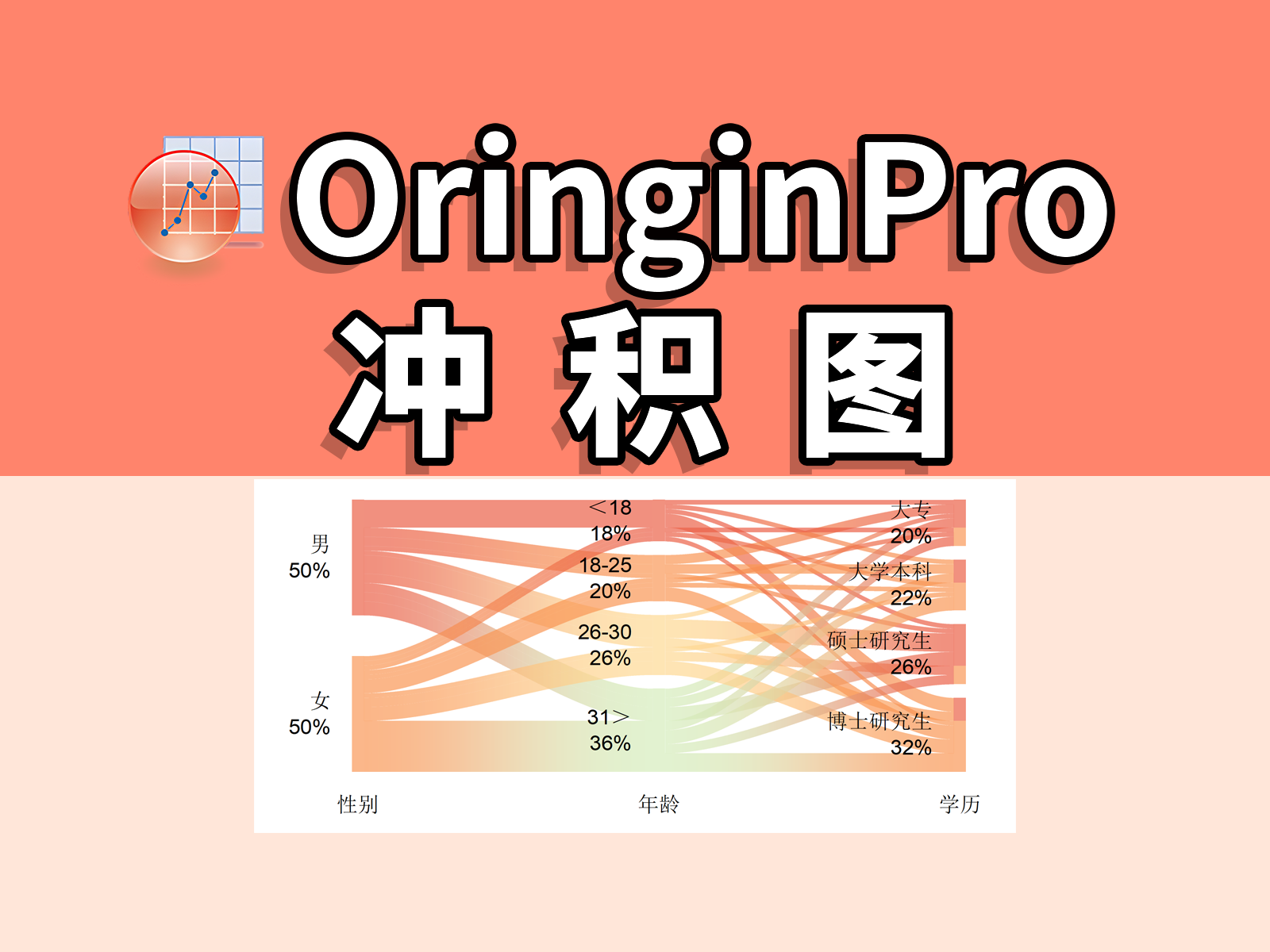
This alluvial-diagram tutorial explains the difference between alluvial and Sankey diagrams, then walks through OriginPro data preparation, plotting, and styling for multidimensional categorical data.
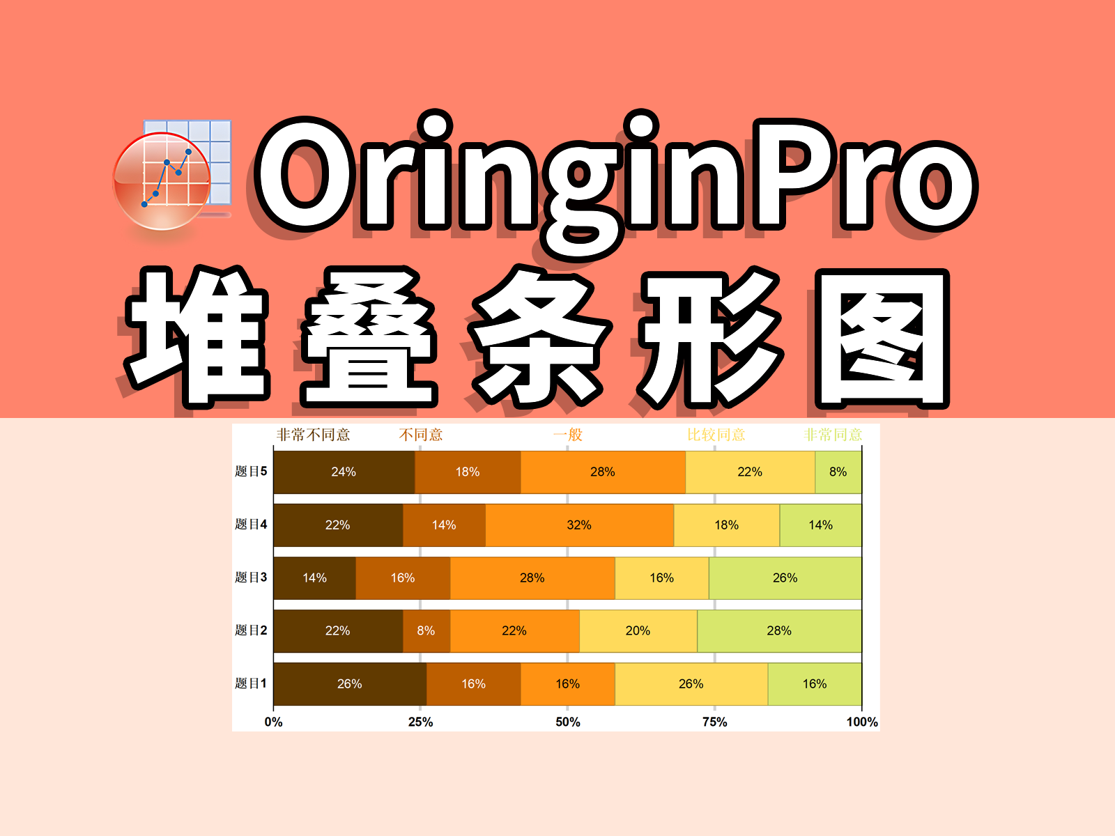
A complete OriginPro workflow for Likert-scale data, from Excel frequency counts to chart styling, category columns, custom legends, axis suffixes, and removing stack connection lines.
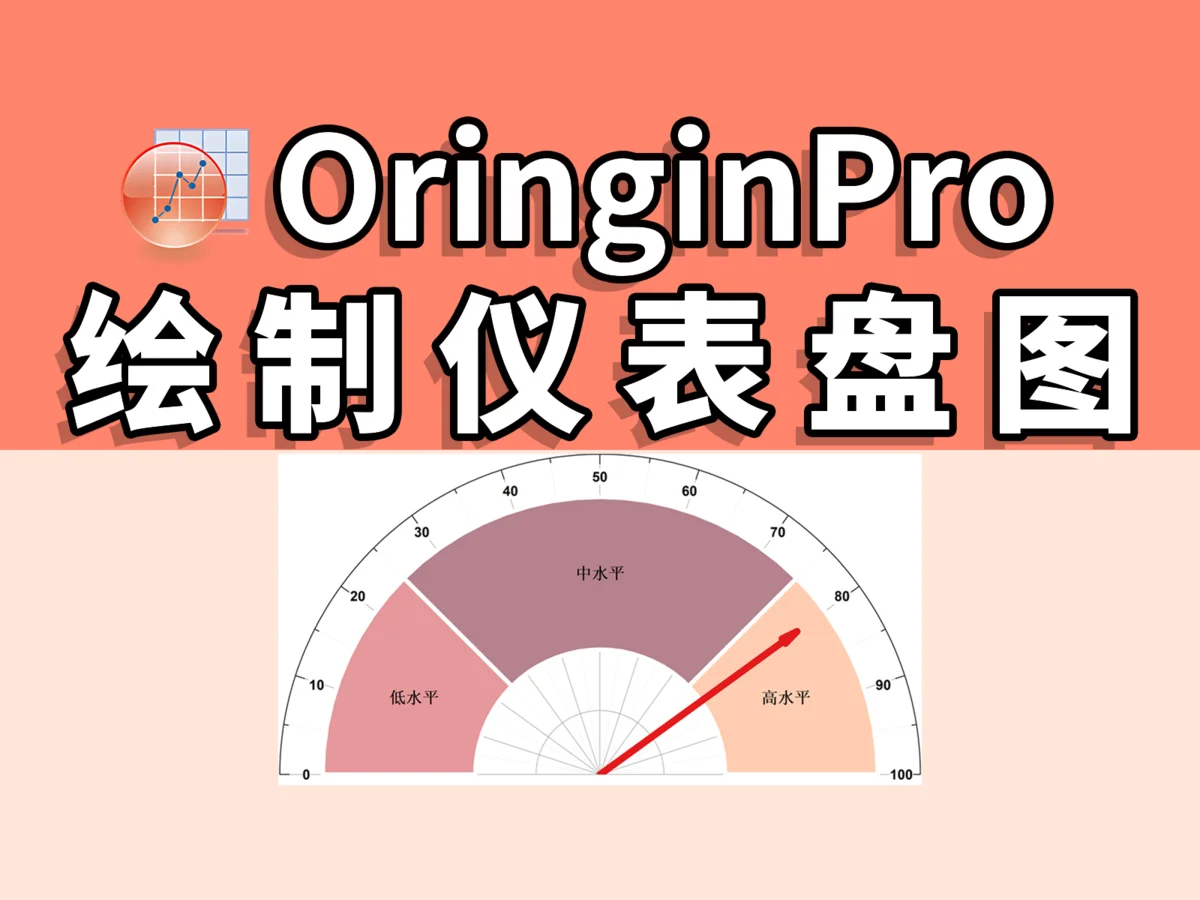
This article explains how to quickly draw a 180° gauge chart in OriginPro using a gauge template, including template download, data preparation, and plotting steps to help you create NPS analysis charts easily.
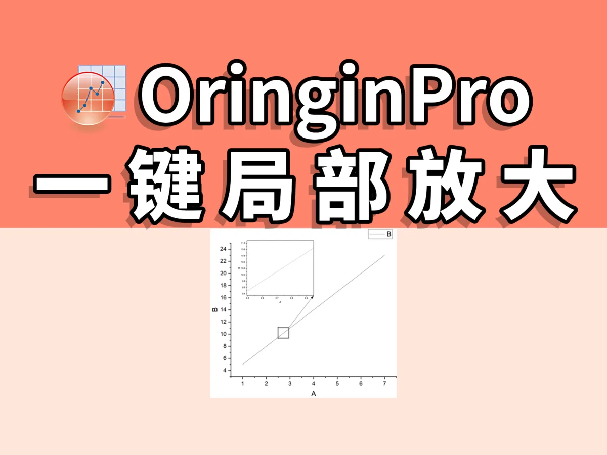
This article explains how to use the Zoomed Inset Plus plugin in OriginPro to create a local zoom-in with one click, covering the complete process from plugin download to fine adjustment so users can improve image-processing efficiency.
This article explains how to import and set color schemes from external websites in OriginPro, including creating new color schemes, adding gradients, changing default colors, and managing color-scheme files for efficient scientific figures and paper writing.
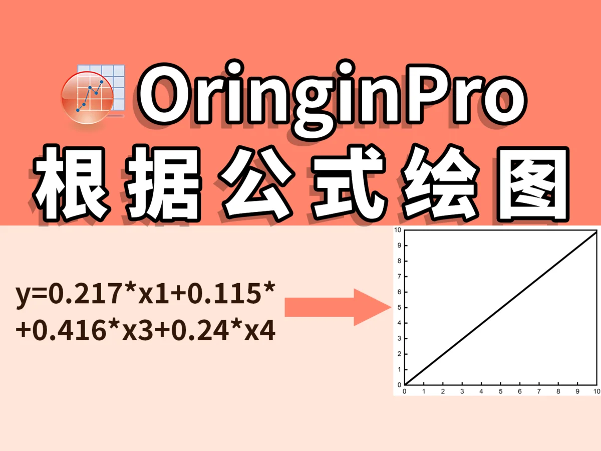
This article introduces ways to visualize multiple linear regression results, including how to draw function plots and scatter plots and how to use OriginPro for data visualization, helping you explain linear-regression models more intuitively.