Introduction#
When reading top-journal papers, have you ever seen those polished, three-dimensional illustrations with refined color palettes and thought: how much code or how advanced a tool must be needed to draw that?
A few days ago, someone on Bilibili asked me under a video whether I could recreate the figure below.
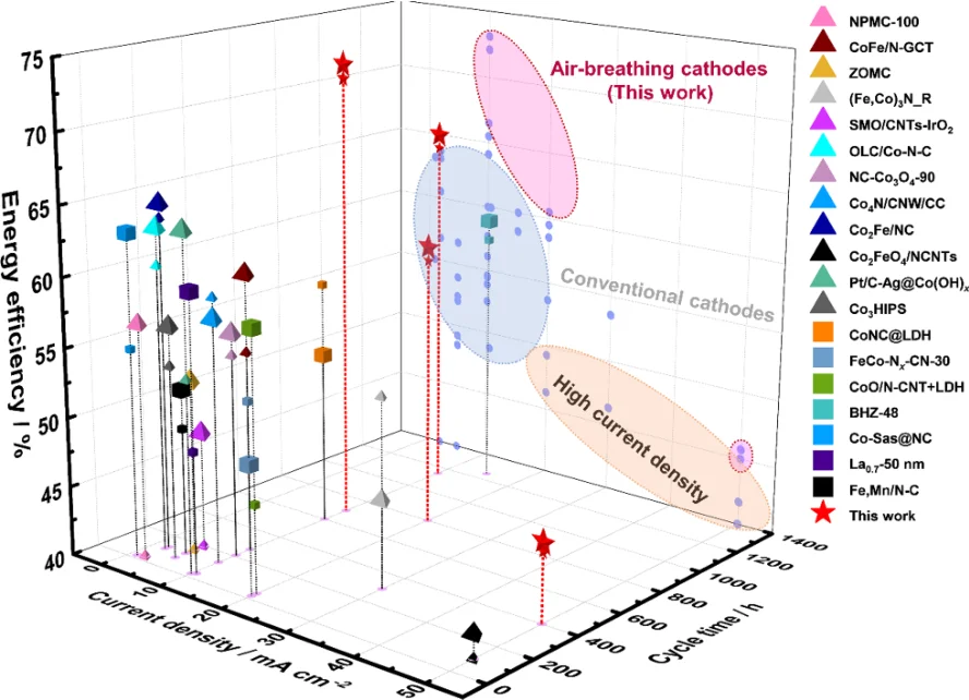
The figure comes from a paper in Nano Letters (🔗 Source: Wan L, Xu Z, Cao Q, et al. Nanoemulsion-coated Ni–Fe hydroxide self-supported electrode as an air-breathing cathode for high-performance zinc–air batteries[J]. Nano Letters, 2022, 22(11): 4535-4543.).
It looks intimidating, with projections and background circles. But the good news is this: if you can draw a normal 2D scatter plot, you already know 90% of what is needed for this figure. The remaining 10% can be learned in a few minutes today.
Data and Project Files#
To make practice easier, I packaged the data, Origin project file, and paper. You can download them and follow along:
| |
Split the Data into Proper Columns First, or Later Edits Will Become Messy#
1. Assign Data Columns First#
Before plotting, one step is especially important: tell Origin what each data column is responsible for.
- After importing the data, set the Energy Efficiency column as the Z axis.
- Set the Category column as Label, because we will use it to distinguish the shapes and colors of different points.
Build the Skeleton First: Draw the 3D Scatter Plot#
2. Draw the 3D Scatter Plot#
Start with the basic structure:
- Select the
X,Y, andZcolumns. - Click
Plot→3D→3D Scatter.
After the chart appears, it will still look like an ordinary 3D scatter plot, without that top-journal polish. Do not worry. The next steps add the real character.
The Journal Look Comes from Details: Shapes, Drop Lines, Projections, and Background Layers#
3. Add Details#
3.1 Point Shapes and Colors Make Categories Easy to Distinguish#
- Double-click the graph to open the
Plot Detailsdialog. - Go to
Symbol→Shape. - Choose
Co1 (D), which indexes the label column to control shapes.
The color setup follows the same idea: bind it to the category column.
Adjust the exact shape configuration in the Shape List on the far right. There is no need to pursue fancy shapes. Clear distinction and readability are enough.
3.2 Drop Lines Give Readers a Landing Point#
In the journal figure, every point has a drop line. This is genuinely useful because it helps readers locate the point in space quickly.
Steps:
- Open
Plot Details. - Find
Drop Lines. - Check
Parallel to Z Axis. - Set
Style (S)toDash. - Set width to
1. - Set color to
Black.
3.3 Projections Put 3D Information onto Planes#
Many 3D charts are hard to read because points float in space without reference. So we turn on projections:
- Check
XY ProjectionandZX Projection. - Set the projection symbol to
Point. - Use light gray or light blue. The key is: do not let the projection steal visual weight from the main data.
The Ellipses Behind the Data Add Polish, but They Are Just a Few Shapes#
4. Draw the Ellipse Backgrounds#
Steps:
- Select the
Rectangle Toolon the left toolbar. - Switch to the
Ellipse Toolinside it. - Draw three ellipses, roughly corresponding to the three data regions.
- Use somewhat richer background colors.
- Set the border to
Dash. - Set transparency to around
60% - 80%.
Then make them sit behind the data:
- Select the ellipse.
- Open the
Floating Dialog. - Choose
Behind Data.
Finally, make small layout adjustments. After selecting the graph, press Tab to switch selection modes, which makes fine-tuning positions easier.
Use the text tool to add labels. If the label color matches the corresponding ellipse color, the result will feel more coherent.
Do Not Let the Legend Steal the Scene#
5. Legend#
Delete the original legend and regenerate a cleaner one:
- Delete the old legend.
- Press
Ctrl + Lto generate a new legend. - Remove the border.
That is all.
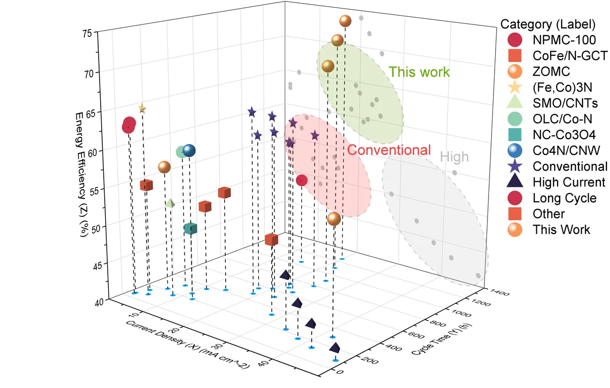
The final result looks roughly like this:
A Polished Look Is Assembled Piece by Piece#
After finishing this figure, you should feel that the polished look of a top-journal figure does not come from extremely advanced techniques or complex algorithms.
It is essentially assembled from simple elements, scatter points, lines, and hand-drawn circles, followed by patient adjustment of transparency, color, and layer order.
The purpose of data visualization is never to show off technique. It is to let readers understand your point at a glance. If the figure is clear and easy to read, even the simplest method can produce a good chart.