Do Not Blame Your Eyes. The 2D Plane Is Just Too Crowded#
When making data reports, you have probably had this frustrating moment: the data itself is clean, but once it becomes a chart, it turns into a spot-the-difference game. Lines fight each other, groups squeeze together, and to follow one line you have to jump between the legend and the plot dozens of times.
This is usually not a problem with your analysis. The 2D plane simply has too little room.
Today we will skip vague theory and talk directly about how to use the magical Z axis. We make the chart “stand up” not for visual gimmicks, but to separate crowded information so readers can see the key point at a glance. I prepared three common scenarios for us to try in OriginPro.
Preparation: Follow Along While Reading#
To make practice easier, I packaged the Origin project files and data used here. Download them and click through the steps while reading.
| |
Scenario 1: Multiple Lines Overlap? Use a Waterfall Plot to Separate Layers#
Suppose we need to show monthly sales for different product lines. In a 2D line chart, several intertwined lines quickly become impossible to distinguish, let alone compare in scale.
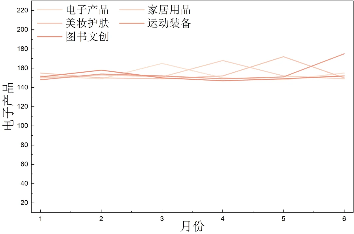
The idea is simple: move the crowded “product line” dimension directly onto the Z axis. Each line gets its own lane and no longer interferes with the others.
📌 Steps#
Select the data and click
Plot>3D>3D Waterfall.After the graph appears, double-click it to open the
Plot Detailsdialog for styling.- On the
Symboltab, choose aSphereshape, set the size to around8, and keep the color asAuto. - On the
Patterntab, set theBordercolor toBy Plotso each line has a different color, set width to2, and setFilltoAutoas well.
- On the
If the viewing angle feels uncomfortable, click the graph and rotate it using
Skew Modein the floating toolbar, or pressTabto switch selection modes for adjustment.
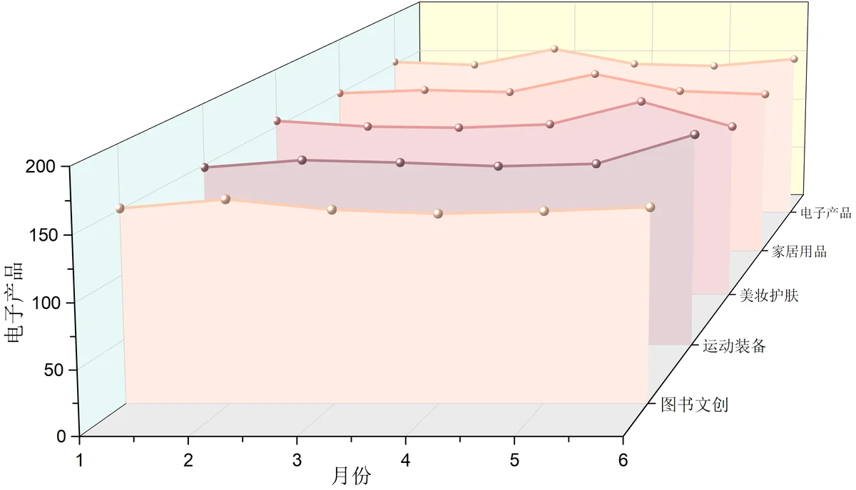
Now readers can follow time trends along the X axis and compare product scale along the Z axis. It is much clearer.
Scenario 2: Too Many Categories? Use a Grouped Bar Chart to Reduce Eye-Jumping#
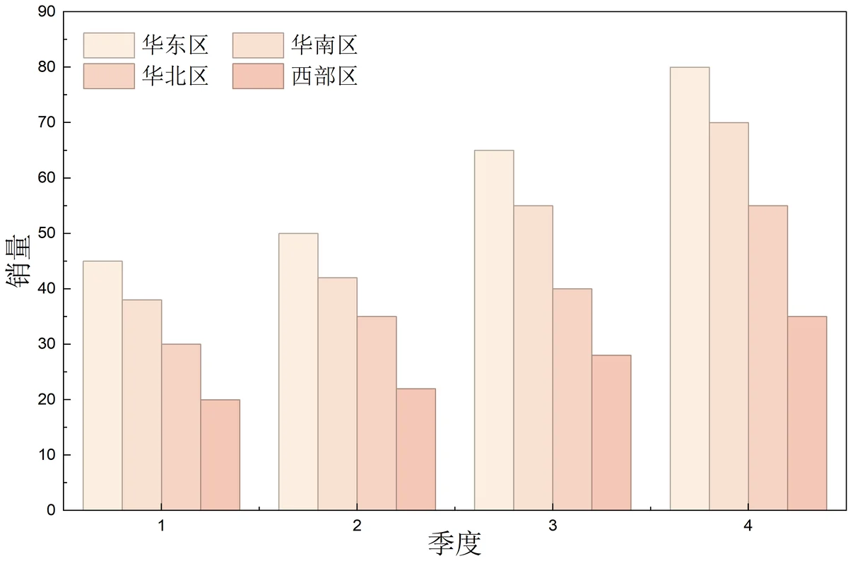
Another example: comparing profits of different regions across four quarters. With a 2D bar chart, there are either too many groups to read comfortably, or your eyes have to jump around the chart to find one region’s data.
📌 Steps#
Select the data and click
Plot>3D>XYY 3D Bars.One small detail: if a region with the smallest sales, such as Southwest, is blocking the front, double-click the
Zaxis and swap the start and end positions so it moves to the back.Style it by double-clicking the bars to open settings.
- In
Pattern, setBorderto none or light gray, setFillcolor toBy Plot, and set width to2.
- In
Key step: default text labels may float awkwardly in space. In the left side of the dialog, click
Layer 1>Axesand checkAll in Screen Plane. You can also use the floating toolbar on the graph, pressCtrl Shift tif it is hidden, and setOrientation of Labels, Titles and Ticks.
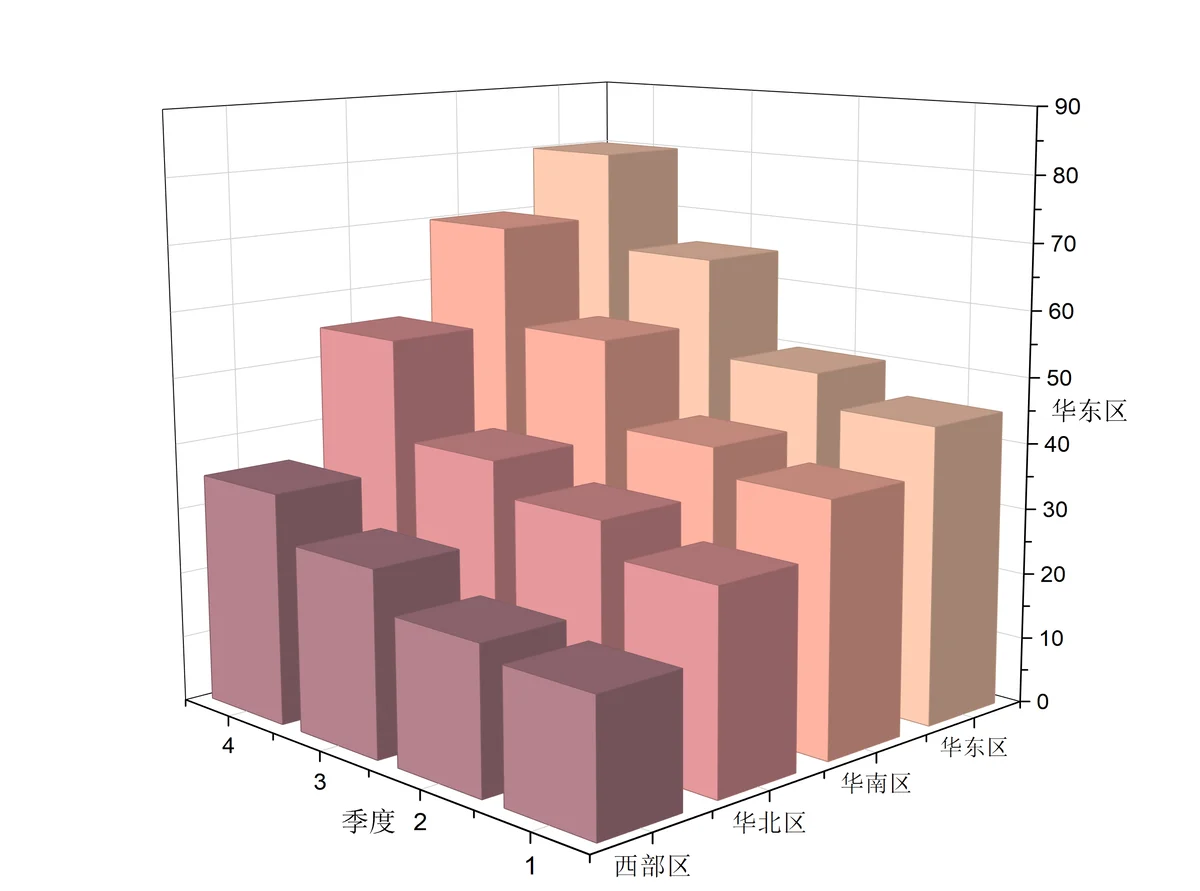
After this, there is no need to match everything against the legend with effort. Just locate a grid cell and read its height.
Scenario 3: Cannot Find the Best Solution? Use a Surface Plot to Read a Three-Variable Relationship#
The last scenario is very practical. Suppose you are optimizing marketing and want to know how “price” and “ad spending” should combine to maximize “sales.”
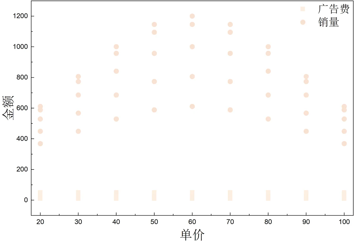
This three-variable relationship, where X and Y determine Z, is hard to read from a 2D scatter plot. A 3D surface plot is more like a terrain map: peaks indicate high sales, flat areas are obvious, and the pattern becomes visible quickly.
📌 Steps#
- Set the data property first: select the sales column, right-click
Set As>Z, and tell the software this is the height variable. - Select all data and click
Plot>3D>3D Color Map Surface with Projection. - If the projection at the bottom appears at the top instead, do not panic. Double-click the graph, find
Move on Z Axis by Percent of Scale Range, enter0, and it will return to the bottom. - For a more intuitive view, click
Colormap/Contours>Filland choose a pleasant gradient, such as cool to warm colors, so height changes become clearer. - Also remember to set axis labels to
All in Screen Planeso the text remains upright.
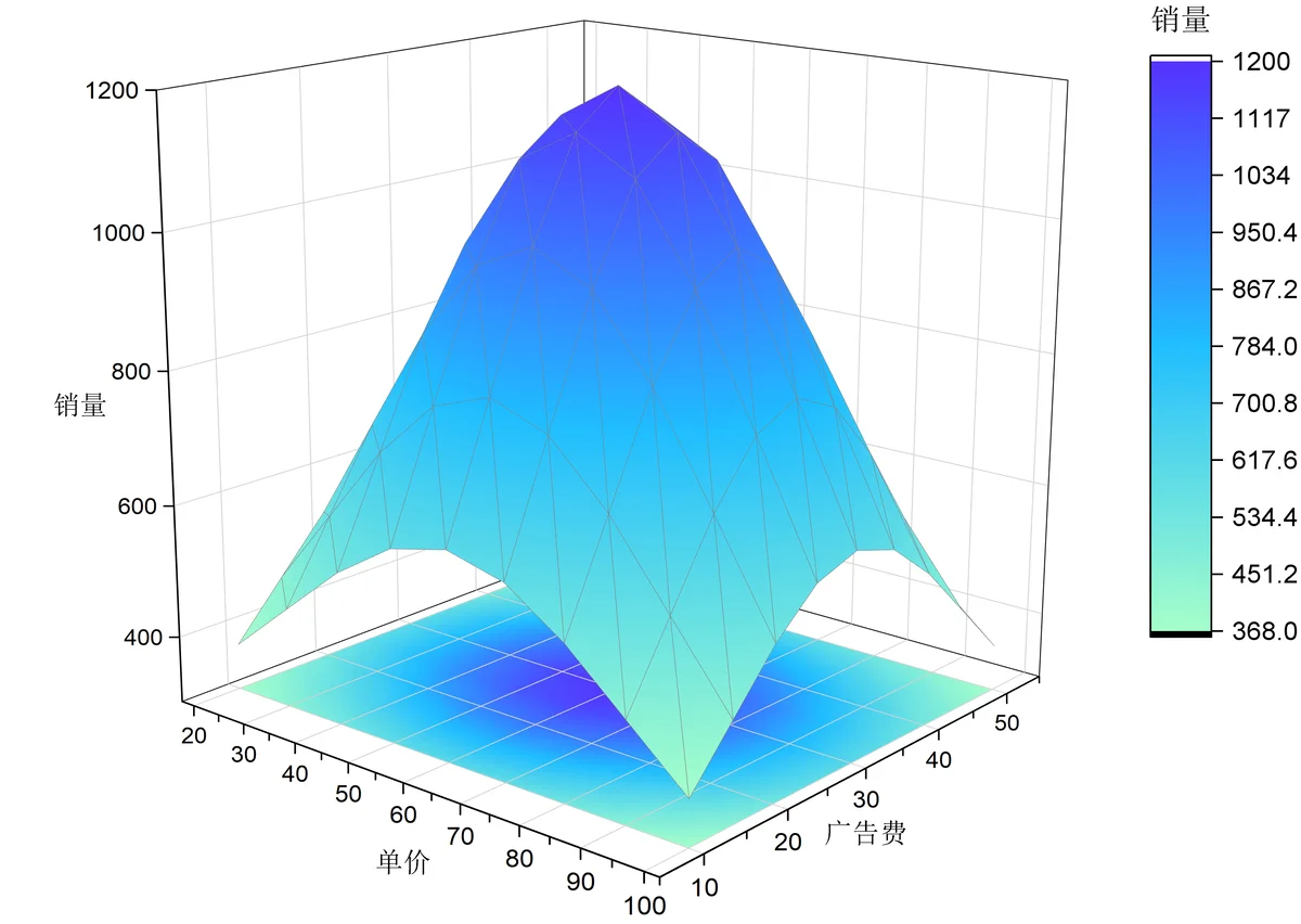
When reporting with this chart, readers can directly see which price and advertising budget correspond to the “highest point,” which makes decision-making much faster.
Use 3D This Way to Make Reports More Efficient#
Turning 2D into 3D is not about making the chart look more advanced.
The judgment rule is simple: if the plane is already too crowded, or if readers need to see the relationship among three variables at a glance, then add a dimension.
A good chart saves readers from mental reconstruction and lets them see the result quickly. Next time you face complex data like this, try today’s methods.