Background#
When I previously worked on NPS analysis, I kept looking for a simple way to draw a gauge chart, but every method I tried was too complicated. Today, I found a template in OriginPro that can quickly draw gauge charts. Its limitation is that it only supports a 180° gauge and a value range of 0–100, but it is still enough for basic needs. So today I will share how to draw one.
Steps#
Download the template In OriginPro, click the top menu
Tools(T)>Template Center(T), then search for “Gauge” and download the template.Prepare the data Next, prepare three columns of data in the following format:
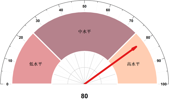
Group name Group percentage Pointer value For example, I set three groups: low level (0%–25%), medium level (25%–75%), and high level (75%–100%), with the pointer pointing to 80%. Then my data should look like this. Note: only the values need to be entered; the header row is just for understanding. The sum of “Group percentage” must be 100, otherwise the chart will display incorrectly.
Group name Group percentage Pointer value Low level 25 80 Medium level 50 High level 25 Draw the gauge chart Select all the data, click
Plot>Extended Templates>Gauge Chart, and the gauge chart will be generated automatically. My final result is shown below: