Background#
After completing a multiple linear regression analysis, presenting the results only as a formula can feel too abstract and monotonous. This article uses OriginPro to walk through three methods for visualizing functions, with a special demonstration of how to combine scatter plots and function plots.
Basic Visualization Methods#
Method 1: Quick Function-Plot Drawing#
- Operation path: Click the top menu
Plot>Function Plot>2D Function Plot. - Formula input rules:
- Merge all independent variables into a single symbol
x. If there are multiple independent variables, enter all of them asx; do not enter x1, x2, and so on because of software syntax limits. - Example: the original formula
y=0.217x₁+0.115x₂+0.416x₃+0.24x₄should be rewritten asy=0.217*x+0.115*x+0.416*x+0.24*x.
- Merge all independent variables into a single symbol
- Parameter suggestions:
- Points refer to the number of plotted points. From previous knowledge, we know points can form a line. The more points there are, the smoother the line becomes.
FromandTorepresent the value range of x.- Here we are drawing a straight line, so set the number of points to 100 and the x range from 0 to 10. If you want to draw a curve, you can increase the number of points appropriately.
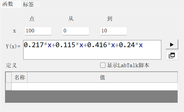
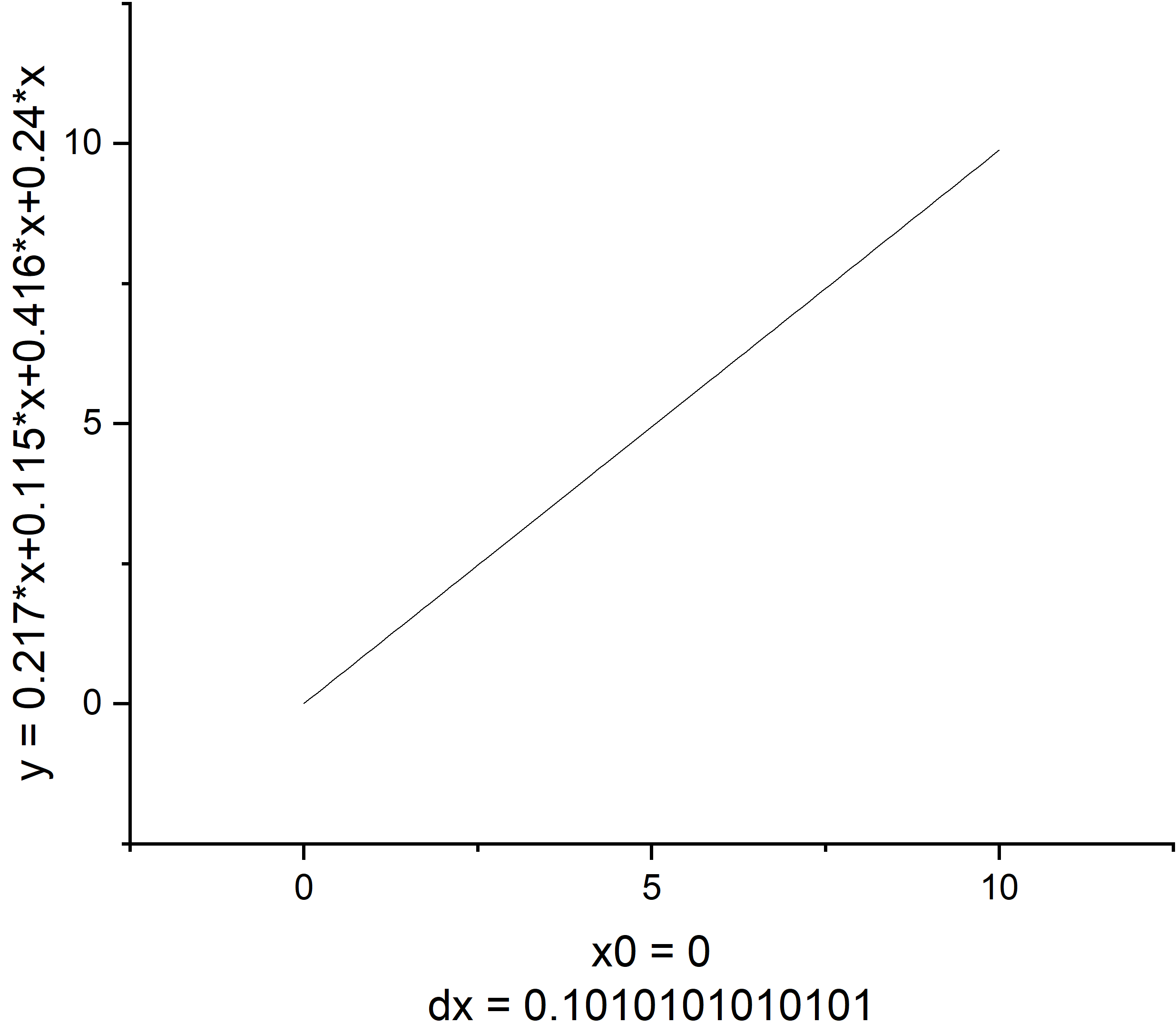
- Graph optimization: After clicking OK, the graph is created. Finally, beautify it as needed.
Method 2: Set Column Values#
Set the independent variable:
- First left-click A(X), then right-click and choose
Set Column Values, and enter the range and formula. - Note that Row should be set to
i, notx. From(F)andTo(T)define the value range of the independent variable i. In testing, the minimum F value can only be set to 0, representing the number of points.- Col sets the specific values of the independent variable. It is best to use
n*i, which generates an arithmetic sequence.
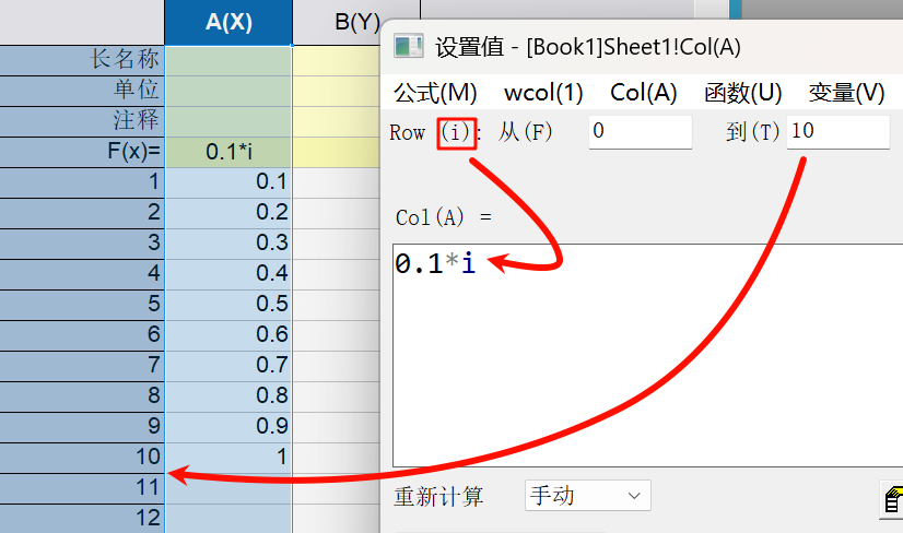
- First left-click A(X), then right-click and choose
Set the dependent variable:
- Left-click B(Y), then right-click and choose
Set Column Values, and enter the range and formula. - Here, Row can be set to automatic. The system will automatically match the number of dependent-variable values according to the independent-variable range.
- Enter the formula directly in Col. Note that because we set the independent variable in column A, x should be entered as A here.
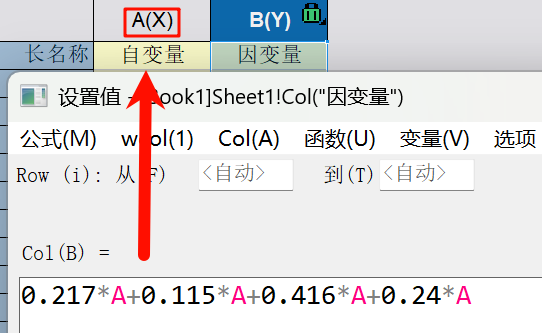
- Left-click B(Y), then right-click and choose
Generate the chart: Select all the data and draw a line chart.
Method 3: Quick Formula-Cell Method#
Directly double-click the F(x) cell below the table and enter the formula. The requirements are the same as in Method 2.
Feature: It generates results quickly, but the default number of points is small. If you need to adjust it manually, right-click the column and open
Column Properties.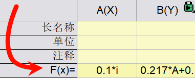
Advanced Application: Overlaying a Scatter Plot and Function Plot#
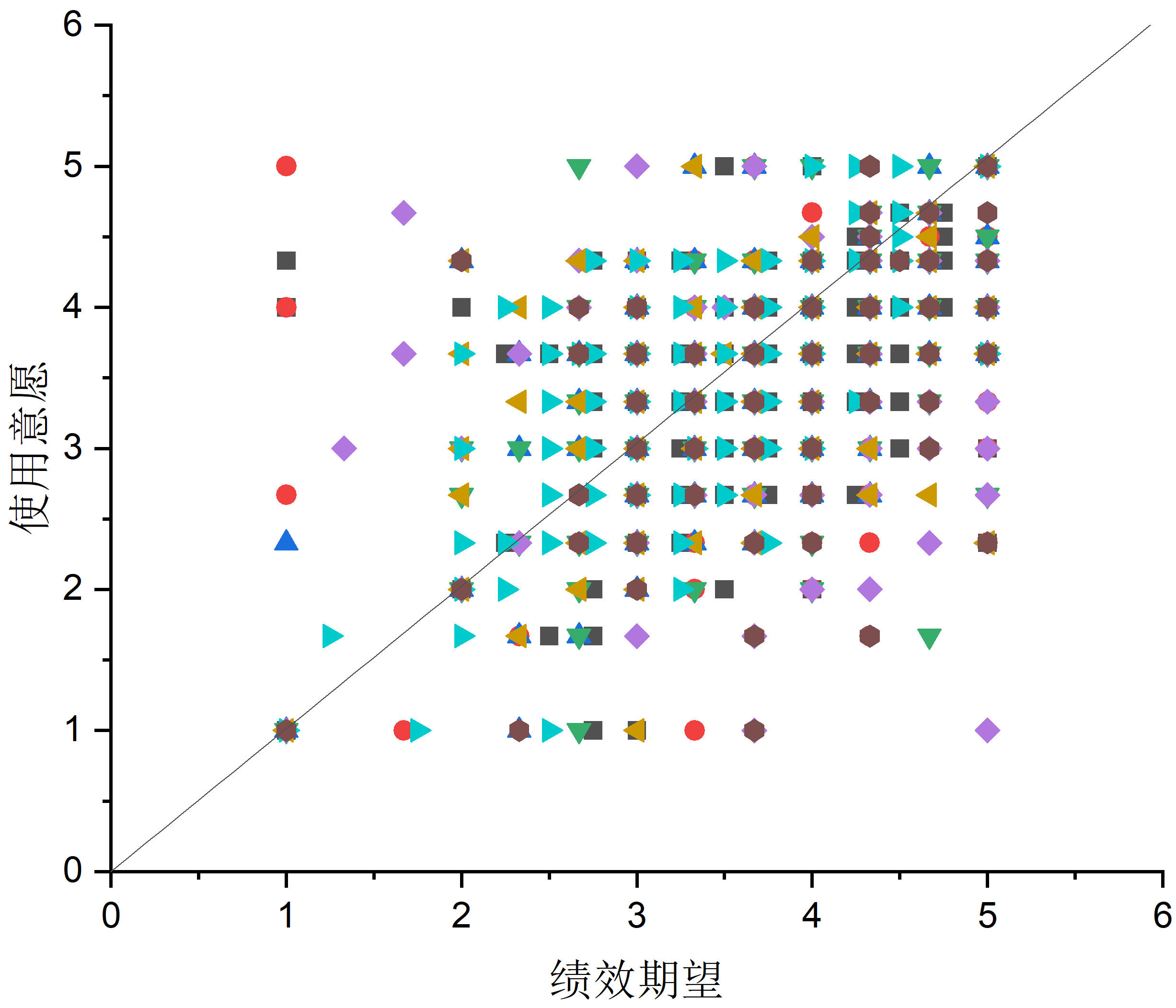
Scatter + function plots are more commonly used in simple linear regression, but if you want to draw a similar chart for multiple regression, that is also possible.
Export function data: Note: if you already have function data from Method 2 or Method 3, you do not need this step. This step is only for a little convenience.
- In Method 1, after drawing the function plot, double-click the chart, click
Function, and change the function settings. Then clickWorkbookto export the function data into a table.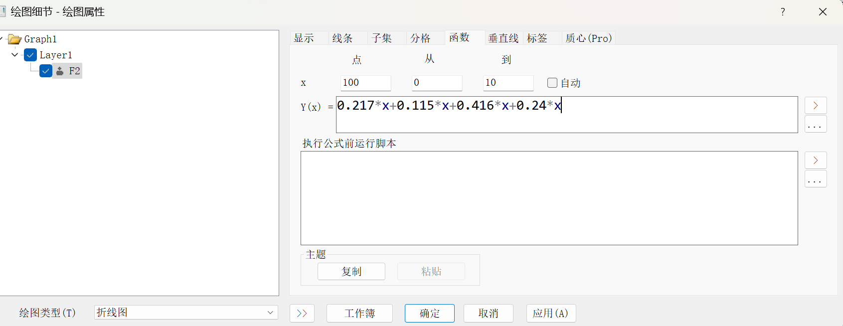
- In Method 1, after drawing the function plot, double-click the chart, click
Preprocess the data:
- Paste the exported data, meaning the data used for linear regression analysis, into an OriginPro worksheet. At this point, set the independent variable as Y and the dependent variable as X to make plotting easier.
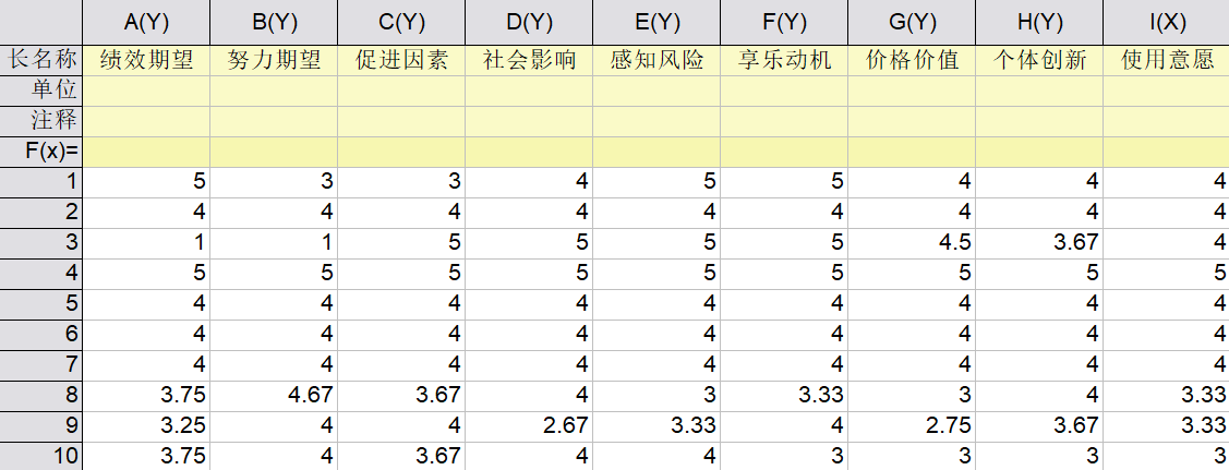
- Paste the exported data, meaning the data used for linear regression analysis, into an OriginPro worksheet. At this point, set the independent variable as Y and the dependent variable as X to make plotting easier.
Create the base scatter plot:
- Select all data >
Plot>Basic 2D>Scatter. - Click the far-right
Swap XYbutton to align the coordinate direction.
- Select all data >
Add the function graph:
- Right-click a blank area and choose
New Layer (Axes)>No Axes (linked dimensions/scale to XY axes)(N). - In the chart window, select “2,” then right-click
Plot Setup.

- Right-click a blank area and choose
Adjust:
- First choose
Line, then select the table containing the function data in the upper window, set the X and Y axes, and click “Apply” to confirm. - If you do not want the coordinate axes to change, uncheck “Rescale.”
- If the worksheet is not displayed, click the far-right arrow beside
Show(S)to display the workbook.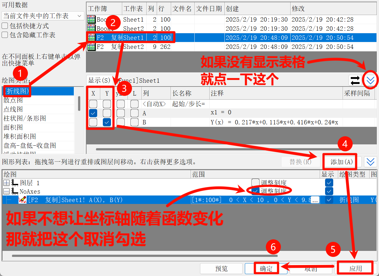
- First choose
After that, the chart is finished. You can then beautify and adjust it as needed.