Background#
When I previously used Python to draw correlation analysis heat maps, I always felt that something was missing. The chart looked a little plain and not quite attractive enough. Today, I decided to try drawing one in OriginPro to see whether I could get a better result.
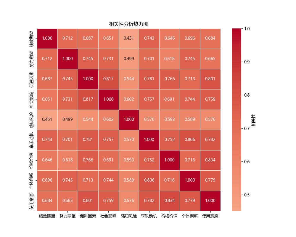
First, here is the heat map drawn with Python: (Python heat map code):
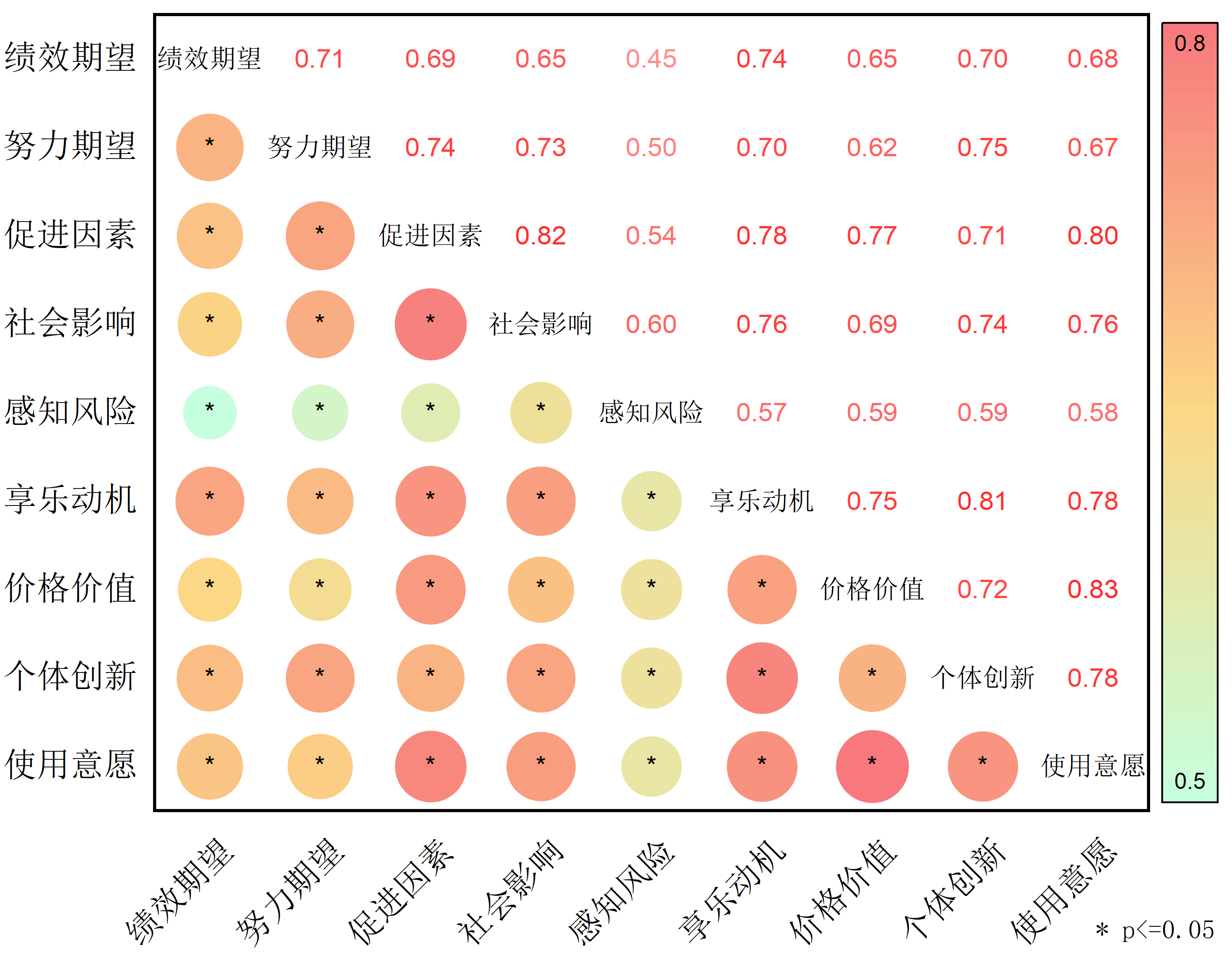
With OriginPro, I eventually obtained a heat map with more complete information and stronger visual impact:
Steps#
Here are the detailed steps for drawing a correlation heat map in OriginPro:
Download the plugin First, open OriginPro, click
Add Appson the right side, then search for and install theCorrelation Plotplugin.Prepare the data Copy the data that needs correlation analysis from SPSS and paste it into OriginPro.
Draw the chart Click
Correlation Plot, chooseSelect Allto select all data, and then clickAuto Previewfor an automatic preview.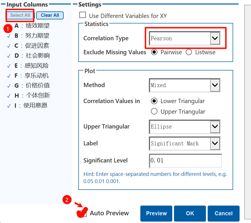
Next, you can fine-tune the chart. For example, choose the Pearson coefficient; under
Method, you can choose mixed mode, text only, or image only; underUpper Triangular, you can choose filled colors or circular patterns; and underLabel, you can choose whether the graphic labels display correlation text or significance levels.Adjust the chart
- Change colors
Double-click the graph to enter the
Color Mapsettings. ChooseLevelsto set the data range, and chooseFillto adjust the fill-color range. - Change the legend
Double-click the legend, choose
Show Labels at, and checkInside End. This makes the legend clearer and more attractive. - Remove border lines
Double-click the outermost axis, enter the
Gridsettings, and uncheckShowfor theMinor Grid Linesunder bothVerticalandHorizontal. This keeps the chart border from looking too cluttered.
- Change colors
Double-click the graph to enter the
Export the image With the graph window open, choose
File>Export Graphto export the finished heat map.
OriginPro’s chart output is indeed more refined and visually polished than Python’s in this case, especially because it presents richer details. If you have similar needs, you can definitely try OriginPro. It may bring a different kind of inspiration to your data analysis.